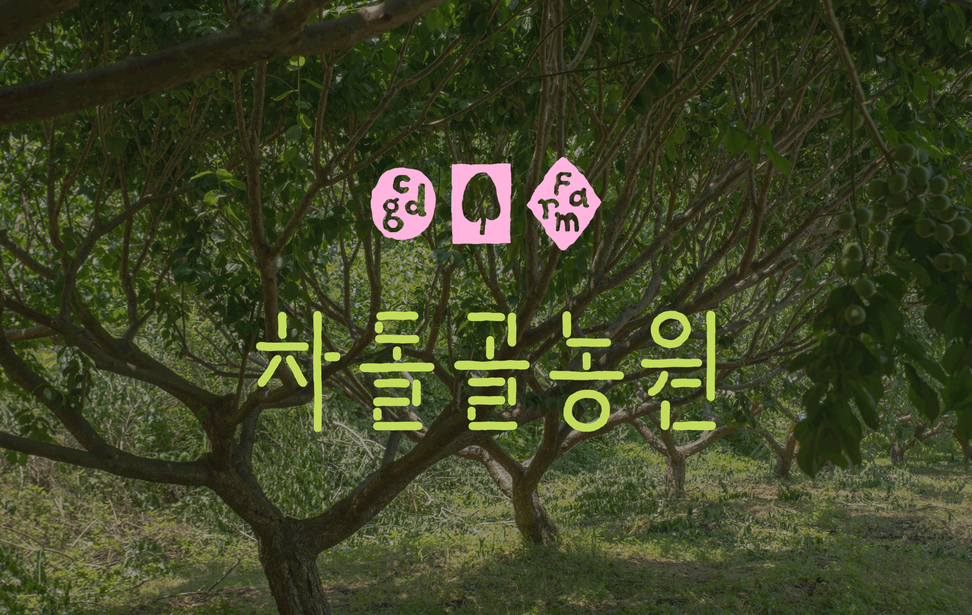
CDG Farm
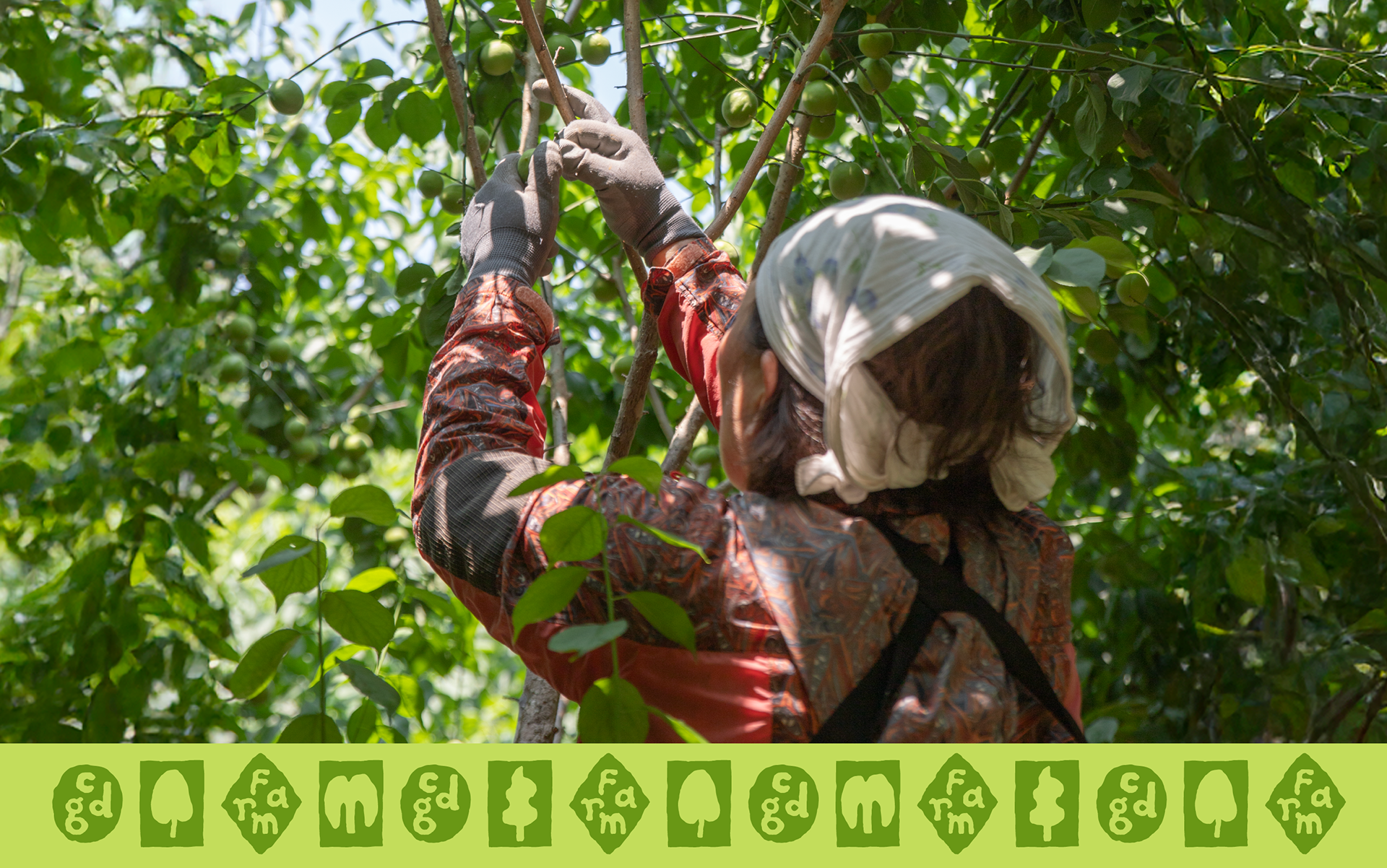
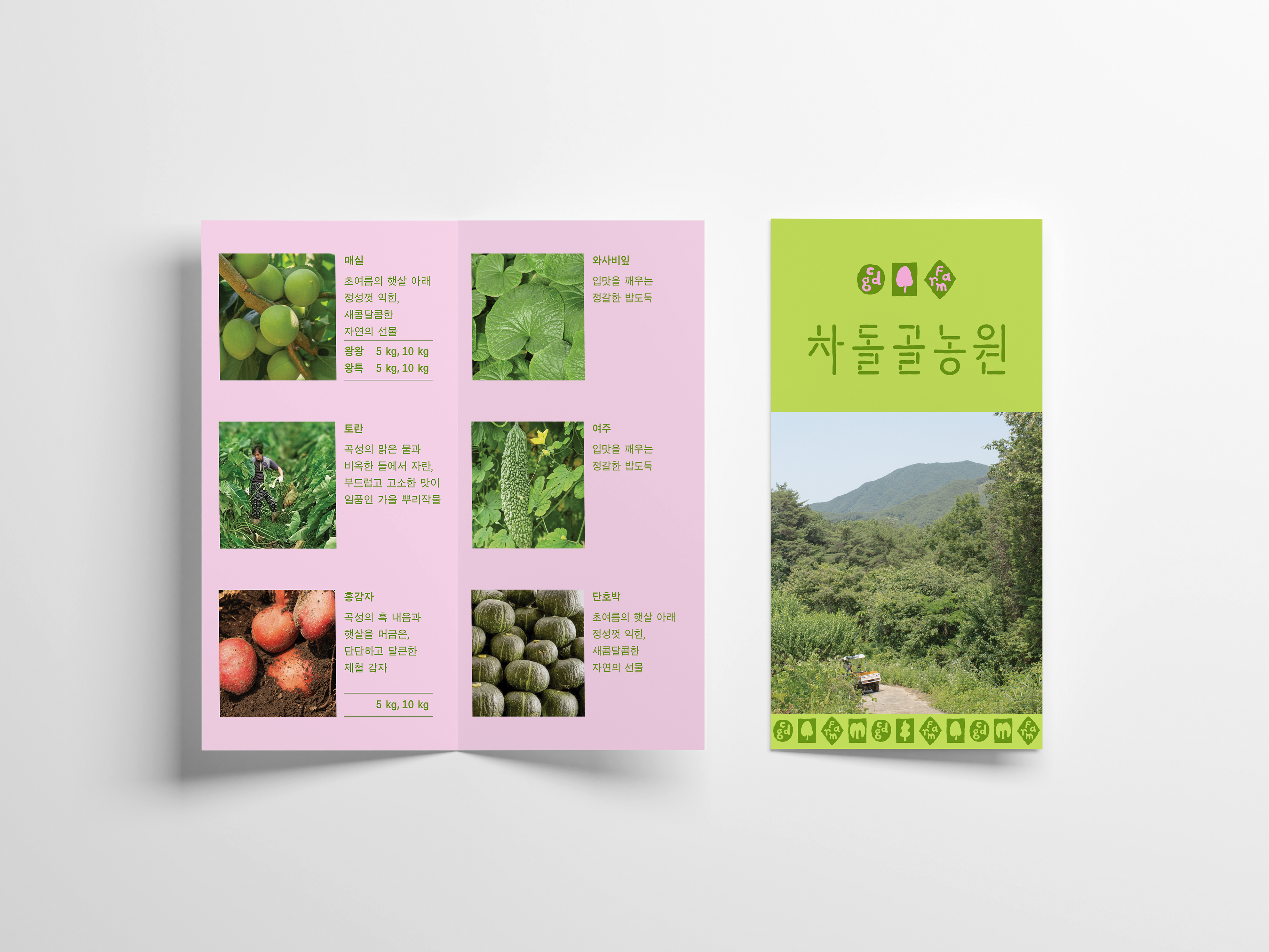
FRONT KIT designed the brand identity for CDG Farm, a local farm producing high value-added crops such as plums, wasabi, taro, and red potatoes.
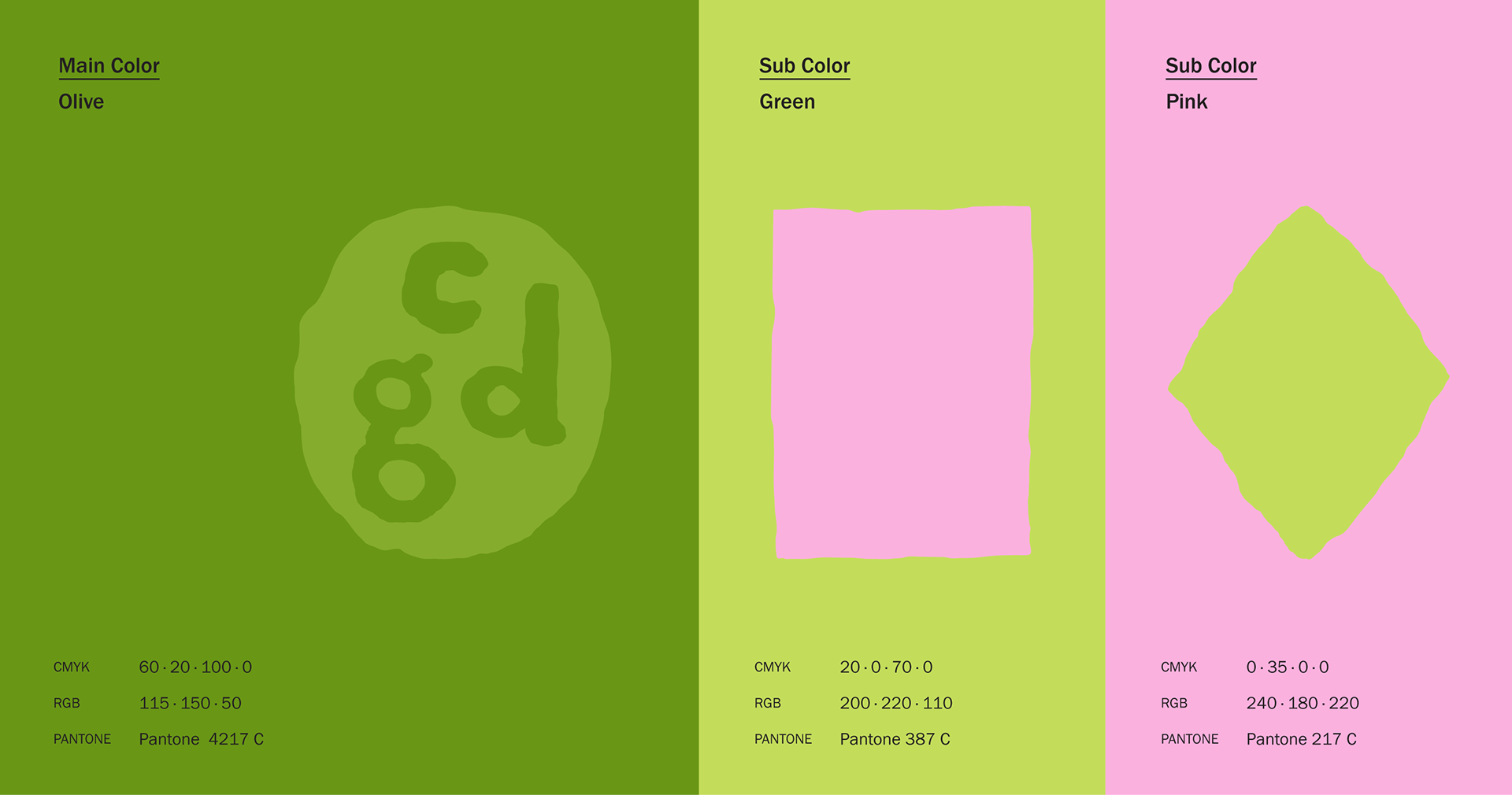
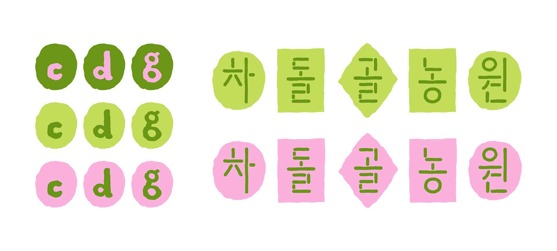
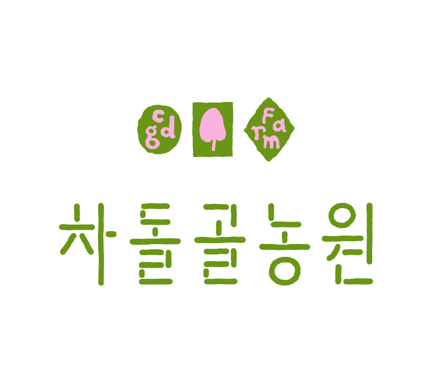
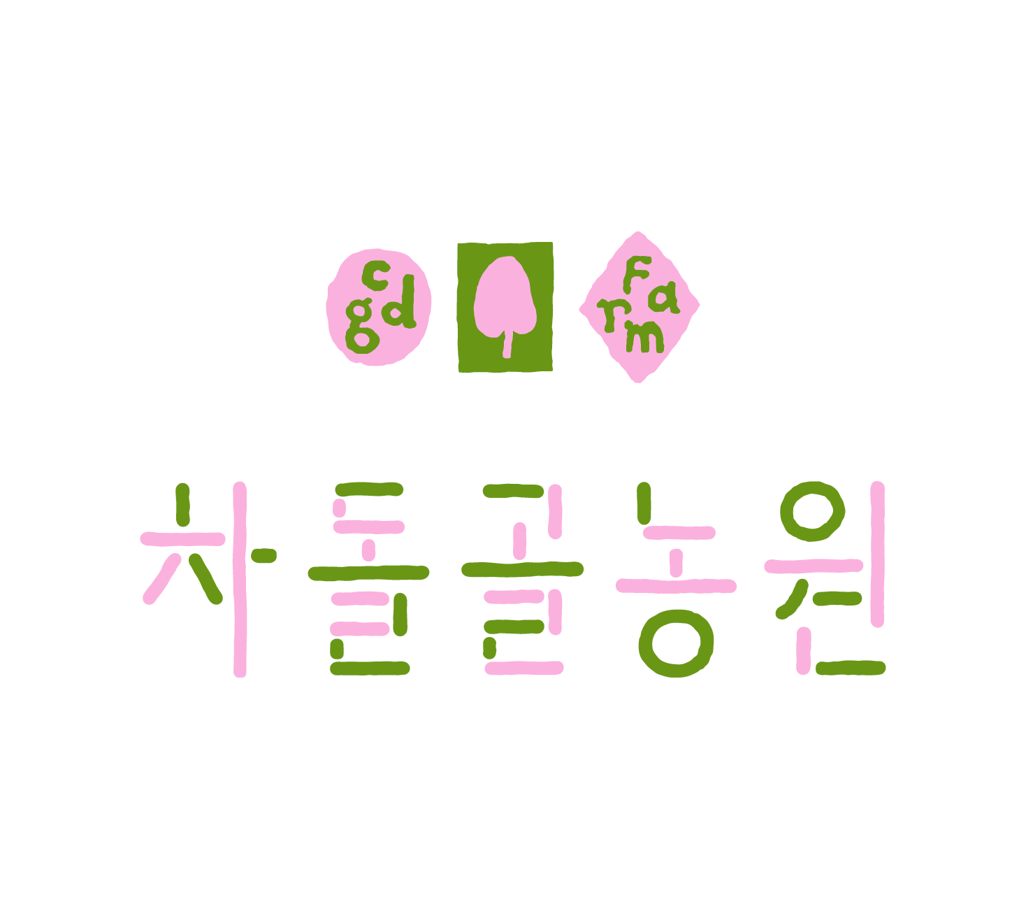
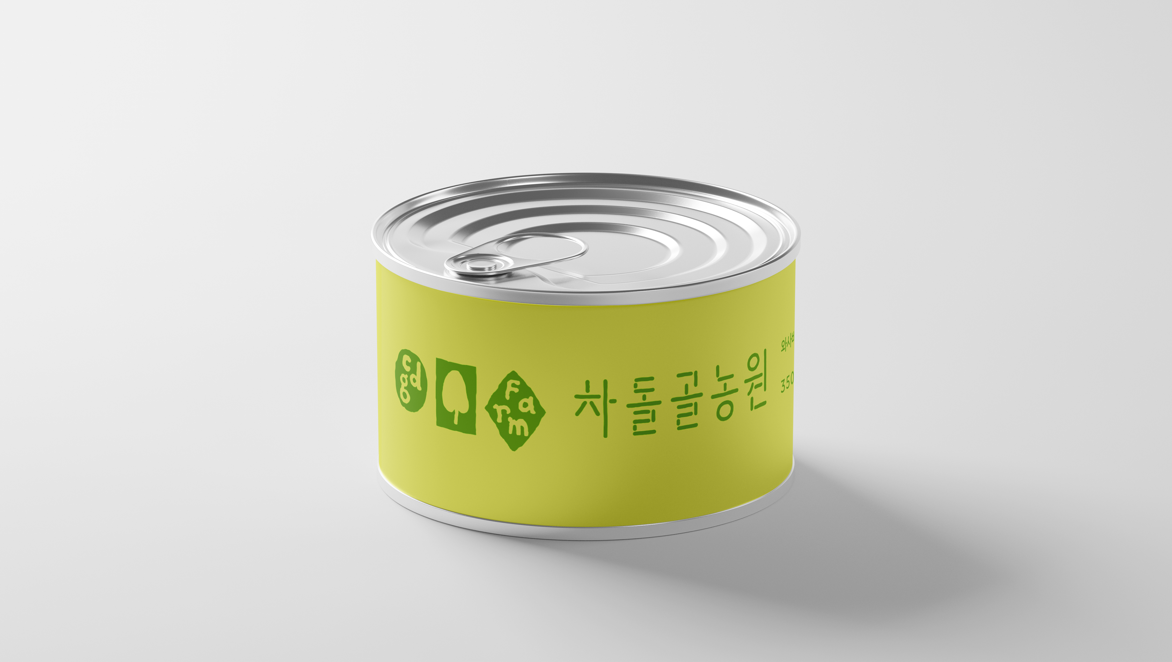
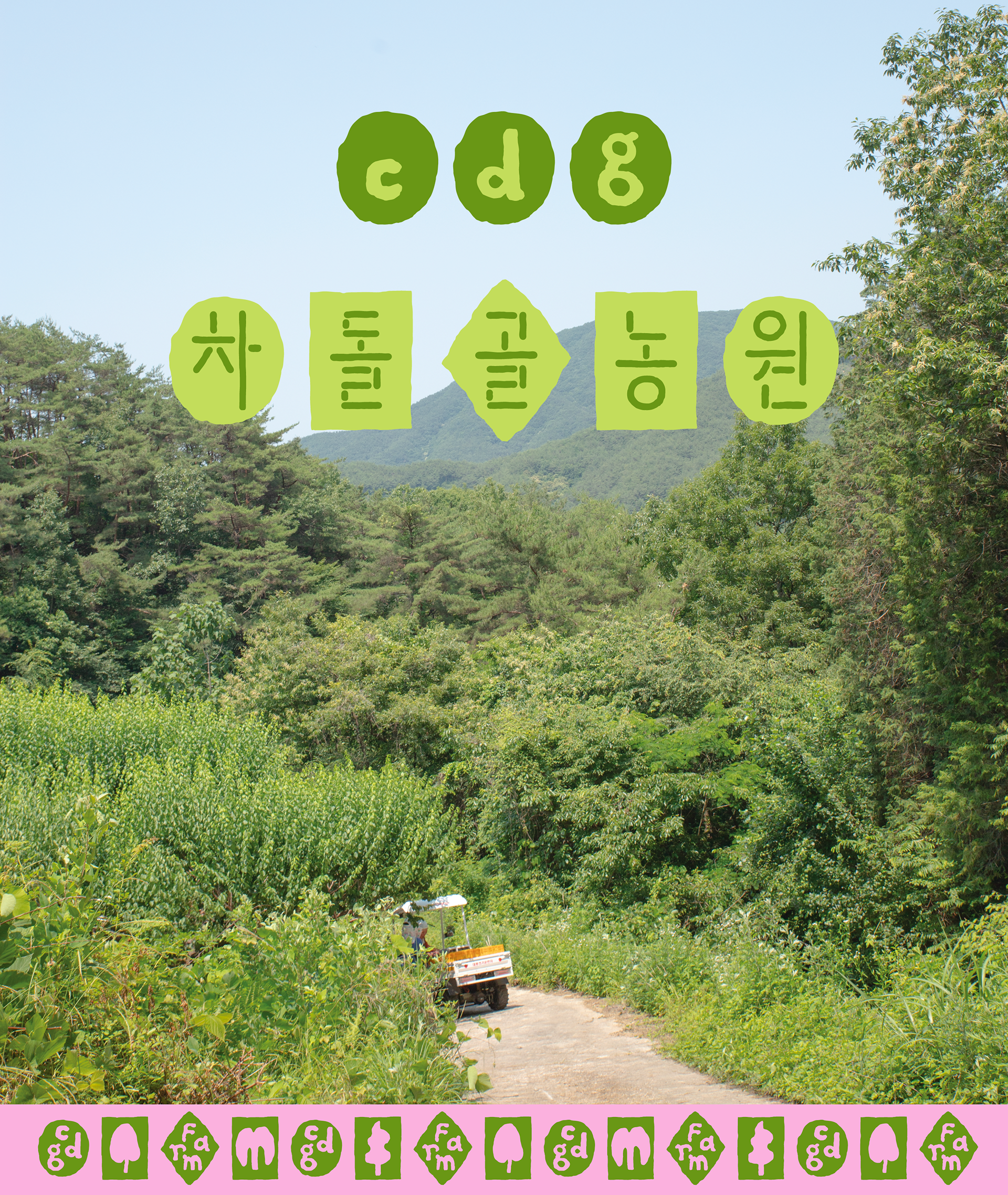
The identity employs typographic forms constructed from the fundamental geometric elements of lines and circles, aiming to convey nature in its natural state. To capture its refreshing yet lyrical atmosphere, a distinctive color system incorporating cool pink was applied, creating a unique visual impression.
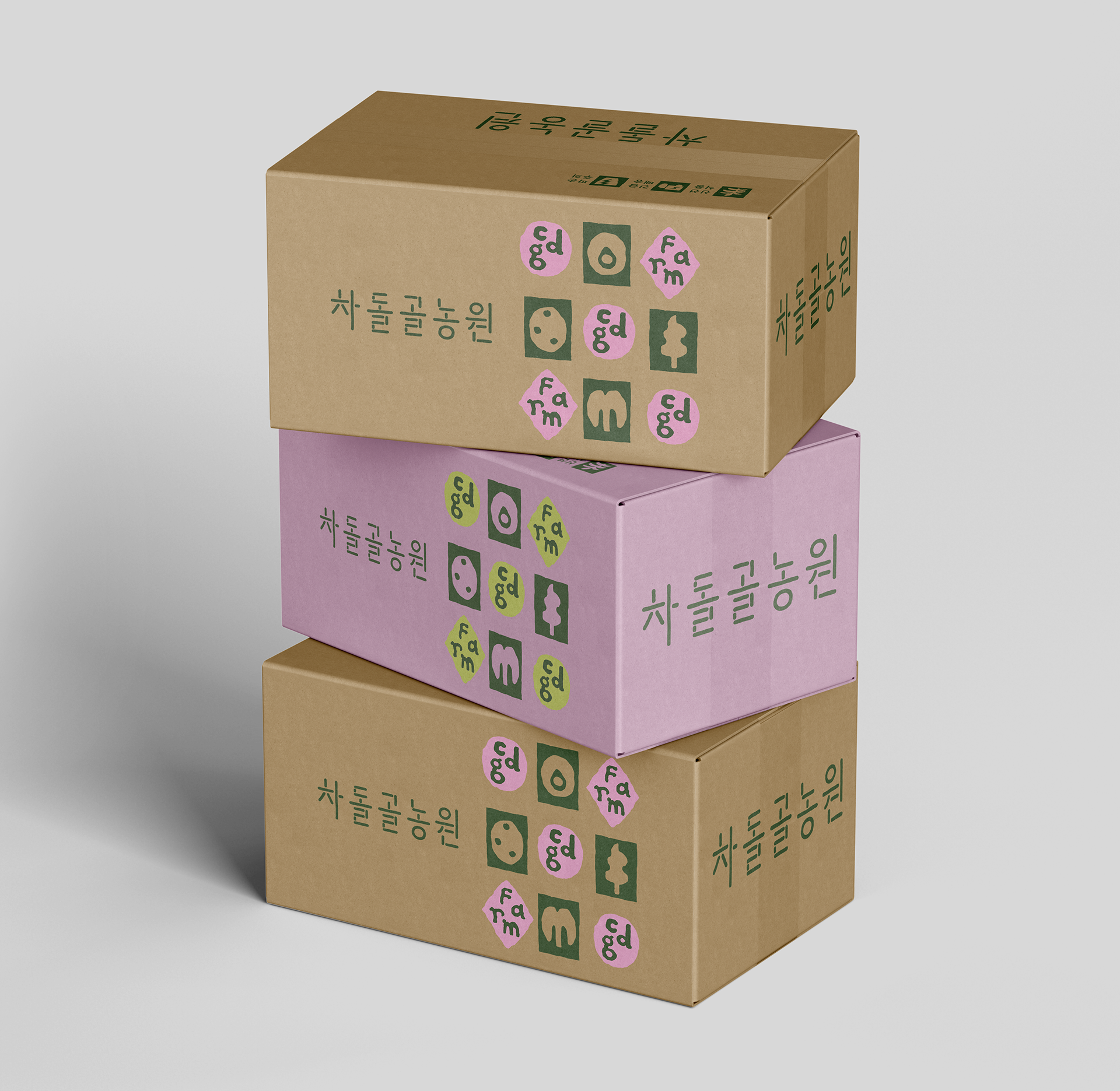
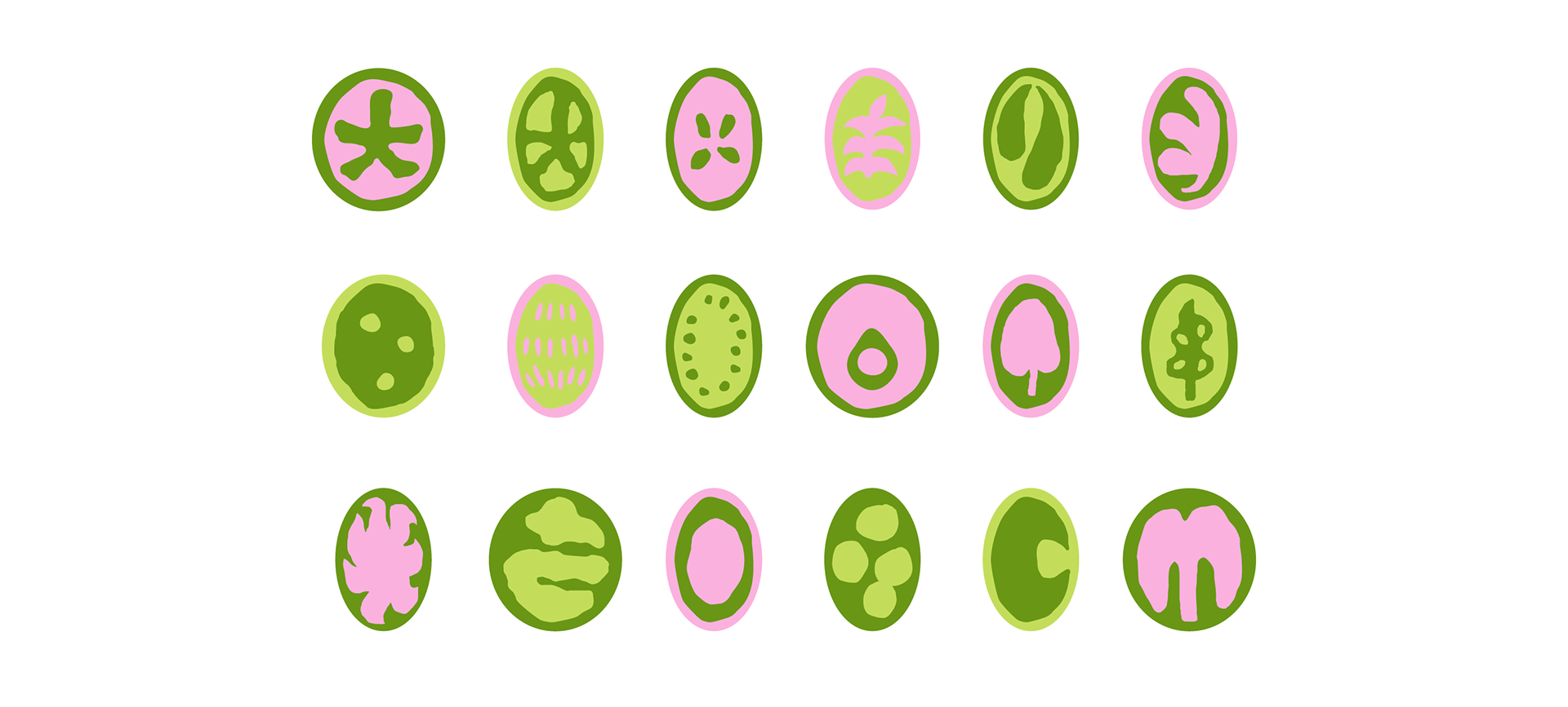
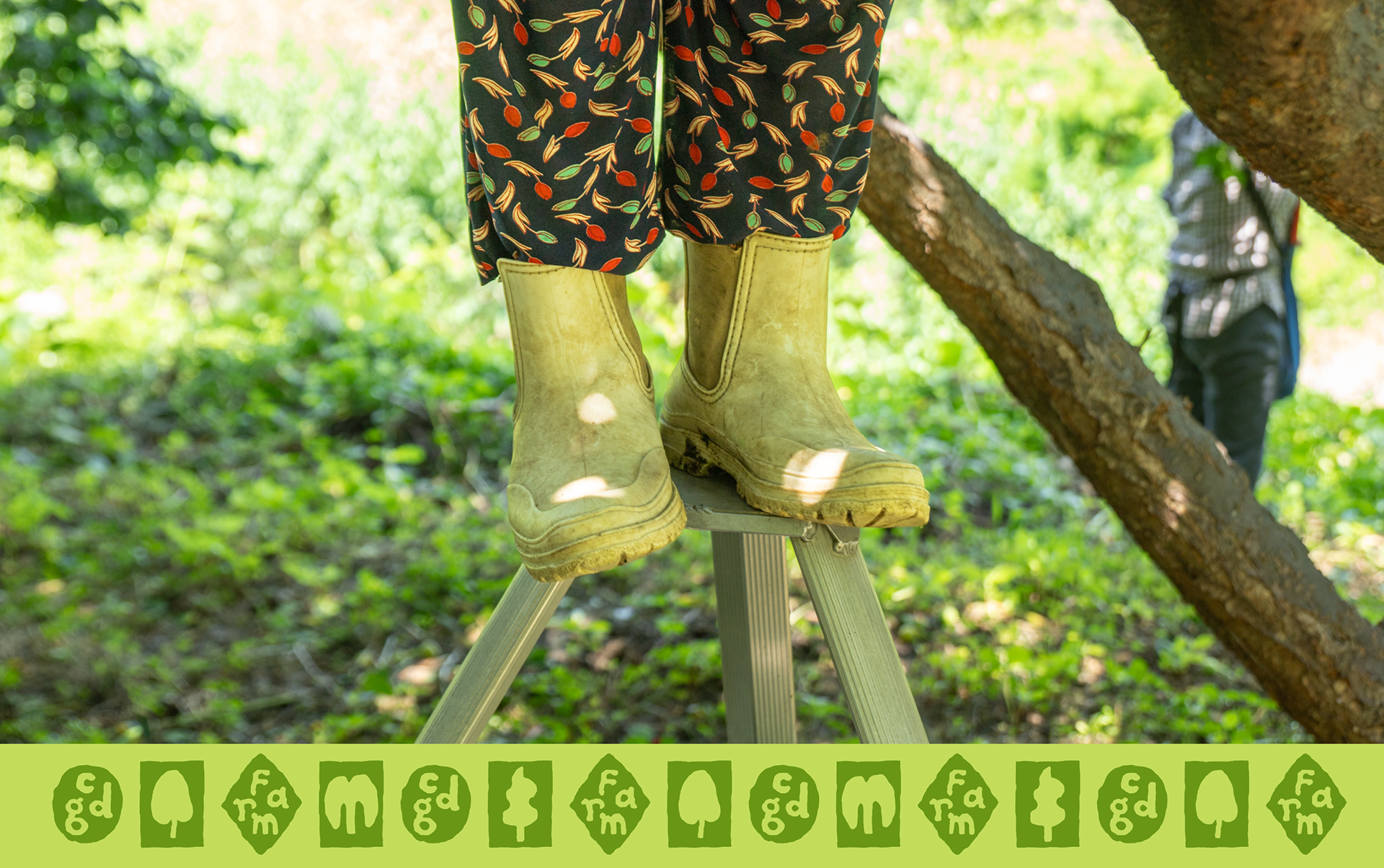
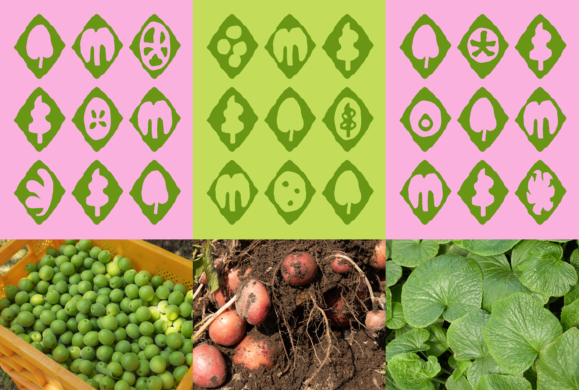
The key visual iconizing the moments of farm life, the slow passage of time, and the varying rhythms and forms of crops represents the process in which energy condensed within the primordial form of a seed gradually materializes into crops. This visual language functions as a central pillar of the graphic identity.
Through this branding project, CDG Farm came to explore business expansion grounded in a renewed brand strategy, while also demonstrating the potential of design as a strategic alternative for small-scale local brands to establish strong brand recognition within limited media environments.

-
Client: CDG Farm
Creative Direction: Min Ah Hong
Creative Direction: Min Ah Hong
Design: Yun Woo Shin
Photo: Yun Woo Shin
Photo: Yun Woo Shin